Appearance
Zeeker infinity icon family
Community that lifts you up.
Every icon uses the official infinity at exactly (32,32), with a 4-unit white stroke (4.4 for favicons). Most use scale .22 and a 70% platform-safe transform. Chat uses scale .20 inside the approved rectangular bubble, with 94% app, 90% favicon and 64% platform-safe framing to keep its tail and inner clear space intact. Do not distort the bubble to force another icon's padding. Product cues use a 3.5-unit stroke before platform framing.
| App | Product cue |
|---|---|
| Social | The centered infinity, with no dots or other product cue. |
| Chat | The approved rounded rectangular bubble, with a straight left edge continuing into the bottom-left tail. Its path comes from ../chat-bubble-path.json, shared with UI icons. The infinity is centered in the rectangular body. |
| Embed | Equally spaced mirrored code chevrons. |
| Explore | A centered compass ring and north pointer for discovery. |
| Admin | Centered horizontal controls above and below the infinity. |
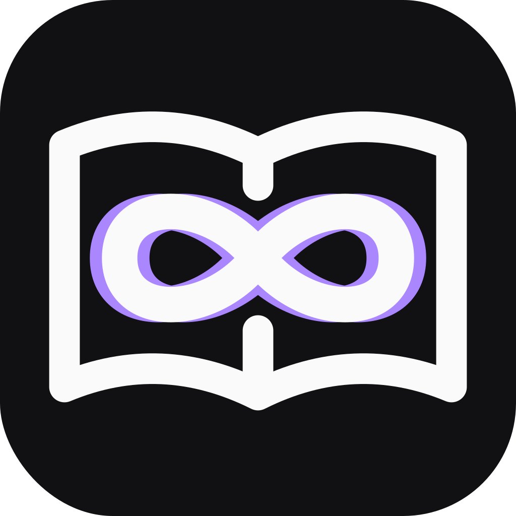
| Docs | Exactly mirrored facing pages and a centered binding. |
| Support | A symmetric headset arch and matching ear cups. |
| ID | A centered avatar head above the infinity shoulders. |
| Legal | A symmetric protective shield with clear space around the infinity, representing rights and safety. |
| Zeeker | Infinity alone. |
Use positive white geometry consistently on #111113. The color accent is violet #AA86FF; never use the TikTok cyan/coral split. Its two equal copies sit at (-1.5,0) and (1.5,0). Their horizontal distance changes together during a brief stepped jitter every 2.8 seconds. There is no vertical displacement, one-sided ghost, blur, glow or shadow. The white infinity and product cue remain stationary.
The gallery autoplays the color treatment, supports pause/resume, and includes View monochrome for direct shape review. Hiding color pauses the visible animation and shows monochrome favicons as well. Restoring color restores the prior playback choice. Reduced-motion users start paused, and SVGs disable animation themselves. Captions describe product roles; Community that lifts you up. remains the only brand tagline.
Both preview.png and preview-monochrome.png are paused contact sheets.
Exports
app-icon.svgand opaque RGBapp-icon-1024.png: full-bleed square artwork. Platforms own the final rounded mask.app-icon-animated.svg: mirrored violet jitter with a stationary white core and reduced-motion support.app-icon-monochrome.svgandfavicon-monochrome.svg: the same geometry without color, for shape review or monochrome use.favicon.svg,favicon.ico, and 16/32/48px PNGs: stronger strokes for browser tabs; no animation.apple-touch-icon.png: 180px opaque home-screen icon.icon-{size}x{size}.png: 72–512px web-manifest icons.icon-maskable.svgand 192/512px maskable PNGs: 70% geometry scale, or 64% for Chat's longer reference tail. Both keep the complete silhouette in the safe circle. Usepurpose: maskable; regular icons usepurpose: any.icon-foreground.svg: transparent, padded native artwork. The native exporter applies Android's additional 66/108dp safe-circle padding.
Support keeps its own identity at /contact and restores Social's icon on exit. Customer branding takes precedence.
Edit and regenerate
Edit generate.mjs, keeping the canonical infinity path intact.
sh
node generate.mjs
ZEEKER_PLAYWRIGHT_MODULE=/absolute/path/to/@playwright/test/index.js node export.mjs
Exports use an existing local Playwright Chromium installation, adding no app runtime dependency. Copy the relevant files to each app's public directory and update versioned icon references for deployment.
Pass an app ID, such as social, to both commands to regenerate only that app and the gallery previews.